Coastal Living - Canadian Style
Recently, an old friend from highschool (which sadly was a loooooong time ago) reached out to me. She has been following me on Instagram and here on my blog and was keen to know whether I would be able to give her a hand doing a makeover of her house.
Although we went to school together in Australia, these days KR (as I call her) lives in Canada. In fact, she has lived there for over twenty years, after meeting a Canadian and deciding to swap crazy heat for crazy cold ;-)
KR and her family live in Novia Scotia, a beautiful part of Canada on the East Coast. Being a child of the 80s, this is the part where I just have to mention that Novia Scotia is right next door to Prince Edward Island… Home to Anne of Green Gables…
Anywhooo… getting back to KR. KR, her husband and three children live in a beautiful home, looking over St Margaret’s Bay. Here are some gorgeous pictures to set the scene.


KR and her husband built this home and it includes a two bedroom apartment downstairs that can be rented out.
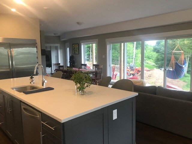
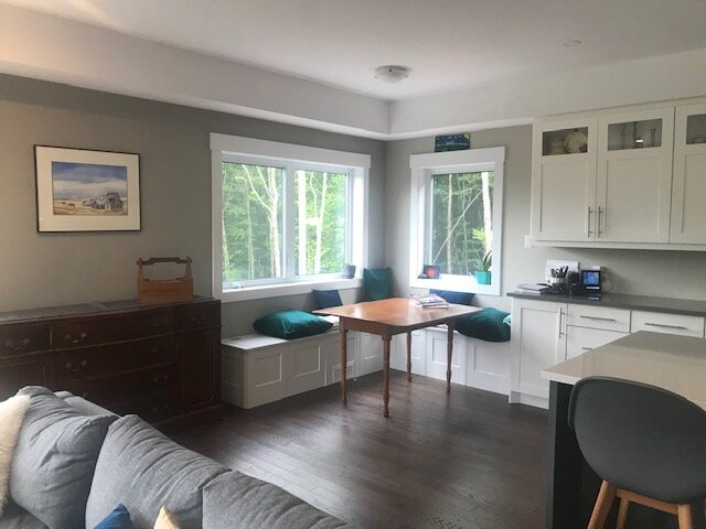
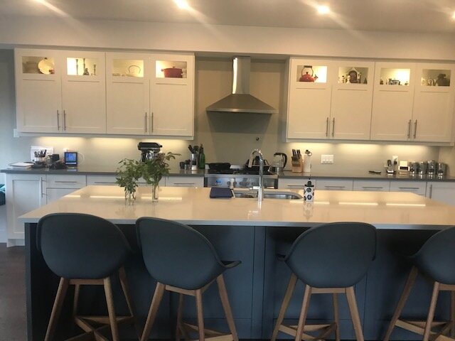
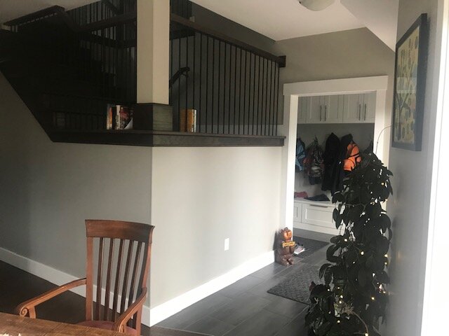
When I first saw photos of her house, I could not imagine what she didn’t like! Check out these pictures. As you can see, the current style is a beautiful mountain cottage look. You can almost feel the warmth of the fire, set off by the brown, grey and tan tones.


Beautiful it may be, but unfortunately for KR, what she really wanted was Coastal style. Not quite the same!
Unlike some people who prefer to rip the bandaid off and hit the credit card big time in one go, KR’s brief was to focus on incremental changes, starting with easy wins in the dining, kitchen and living spaces.
Defining a Coastal look - the brief
Given that, the first thing to do was to make sure we were on the same page when it came to our interpretation of Coastal. Creating a trusty Pinterest board for the two of us, I started to save various images that I thought would be of interest. Here is a link if you are interested. https://www.pinterest.com.au/theinteriorologyden/krd-canada-august-2020/
Thankfully we were indeed on the same page, and I did not discover (as I had feared) that the Canadians have some entirely different idea of what Coastal style means!
Based on her selections, clearly, and unsurprisingly, the focus was to be on lightening and brightening the spaces, as well as employing hues of blue while creating some warmth with browns and creams.
Unlike the recent Tween Bedroom Makeover project, KR was not so interested in the placement of furniture as she was in combining existing furniture with some colour and style advice to shift towards a more coastal look.
Given that, I dispensed with the need to develop 3d renders, even though I do so love doing them!
Instead I decided to go straight to the mood boards or concept boards. This way I could give her a visual example of how she might use products similar to her own, and combine and compliment with colour and other items to pull off that beautiful coastal living style without going crazy on the spending front.
Given the size of the spaces under review, and the different functions performed across them, it quickly became apparent that I would not be able to deliver everything she wanted with one single style board. Clearly I need to break it down into zones, which I did.
Zone 1 was the living area around the fire.
Zone 2 was the kitchen area.
Zone 3 was the dining nook.
However, first I needed to consider the colours of the walls as these would flow through all spaces.
Creating that Coastal Look
Paint and colour scheme
My preference is to have one colour that runs consistently though a house, with perhaps some accent walls as appropriate.
Currently KR’s walls are painted a sort of dark greige. An easy and relatively cheap first step in shifting towards a coastal look is to repaint the walls. My preference is for a clean, crisp white. In this case, I have selected Dulux’s White on White, described as a clean, minimalist white that creates both a timeless and contemporary feel to any space. Of course KR will need to find a similar white from a Canadian brand.
Another bonus about lightening up the walls will be that the beautiful view out of KR’s living space windows will stand out more, no longer partially competing with the darker walls for eye time.
To continue the lightening of the house, I have also suggested to KR that she re-paints her balustrades in white, shifting them from a feature to a functional part of the house only. The kitchen cabinets are already painted white, so one less thing to worry about thankfully. A quick tip here though - all whites are not the same! There are as many shades of white as I have had hot dinners. KR will need to make sure that the whites in her house match up or better yet, are the same.
Applying the golden rule of design (60/30/10), I have proposed that white makes up the 60% of the space. Of course, there is still plenty of room for other colours. In this case blues (navy and lighter shades) should make up about 30% of the colour scheme and then tan (in the form of rattan and jute) the 10%.
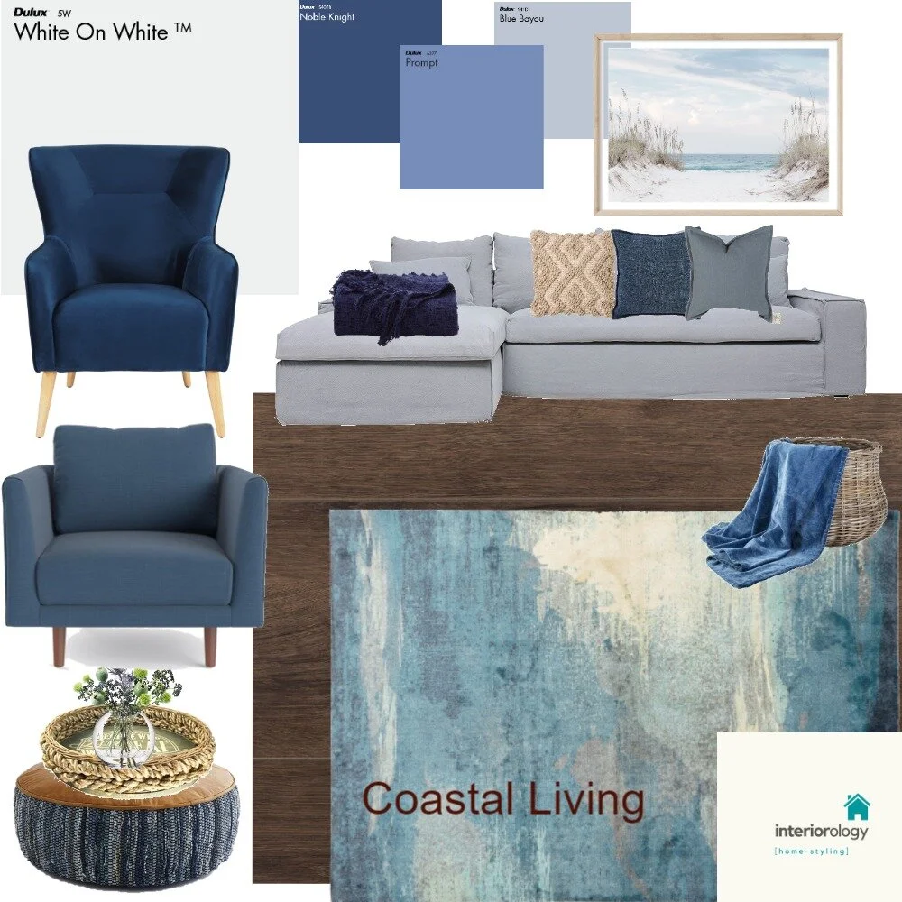
Zone 1 - Living space
When it came to this area, KR’s brief was to ensure adequate seating for her family, including a sofa and two chairs. Luckily for both her and I, her existing sofa is a beautiful neutral grey. No need to change that! Immediate cost savings there :-)
My focus in this area then was to find colours and furniture that would compliment the grey sofa and create that coastal feel.
As you can see from the mood board below, I did this by suggesting the use of blue (in various shades) as an accent for the area. While the wall and sofa remain neutral, blue can be applied to soft furnishings such as cushions and blankets as well as to the two desired occasional chairs. Tan can be added in the form of the baskets, cushion and ottoman, Choosing a rug that ties in all the colours selected finishes the room off beautifully.
Zone 2 - Kitchen and Formal Dining
Once again, KR’s existing furniture and kitchen cabinetry have been tastefully selected and so mean that really only cosmetic changes are necessary in order to carry the coastal look into her kitchen and formal dining zone.
In this case, I have suggested keeping her dining table but changing the chairs to a combination of both navy blue and cream white chairs. By selecting a small number of navy chairs and then selecting cream for the rest of the chairs, the eye will be immediately drawn to the pop of blue colour, helping to ‘set the scene’.
In the kitchen, I have suggested repainting the cabinets of the island bench to a soft mid-tone blue and replacing the current high chairs with rattan style chairs to tie into the brown tones that I have used as little pops throughout the three zones. The main cabinetry in white can be retained. I have also suggested replacing the current silver coloured tap with a rose gold one. I just love rose gold and I think it gives the area a nice pop, once again tying in with the rattan/jute/brown pops of colours. What do you think?

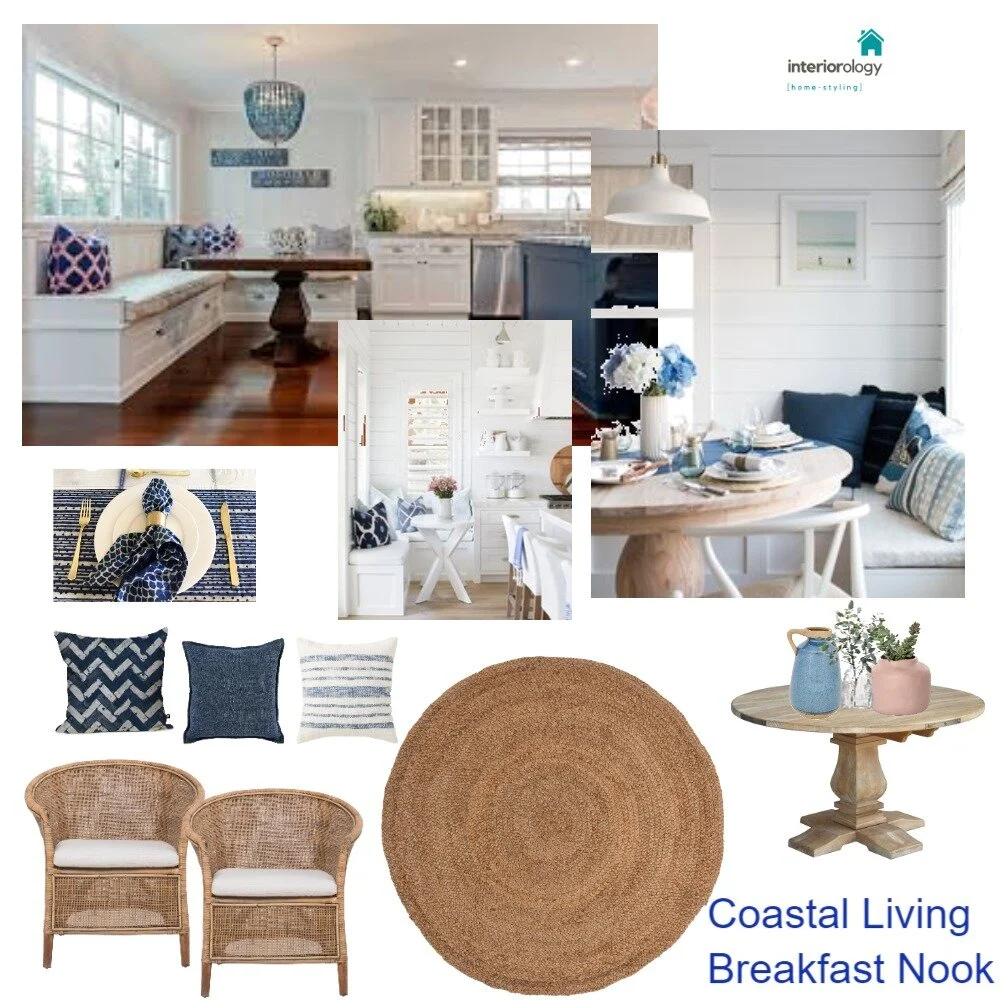
Zone 3 - Breakfast nook
This last spot is one that has caused KR some consternation, Such a gorgeous nook, but KR was stuggling to incorporate a coastal look into the space. Luckily for her and me, Pinterest is full of similar nooks decked out in coastal styling. I really didn’t have to do too much for this area, instead focusing on some beautiful examples and suggesting how she might shop to match the look.
Curtains and Rugs
Lastly, KR was keen for some advice when it came to both window furnishings and rugs.
Rugs have already been covered… but here are some pretty additional suggestions that I put to KR. Her main aim is to reduce the transfer of noise to the apartment below. Using a combination of jute, and soft patterned rugs creates a sense of softness but texture. Also, using tan and blue/grey colouring is a clear nod to the requested Coastal style that KR is so keen on.

Curtains however were something that still had to be addressed.
Given the beautiful views outside the windows, my suggestion to KR was that she put in sheers. Floaty and etheral, they will compliment the sort of look she is going for, while providing some privacy. Better yet, given the architrades already built into her ceiling, I have suggested that her drapes be inset to the top of the wall. The longer the curtain, the longer the window appears, even if that is not the case.
However, being Canada, there is no getting around the fact that 6 months of the year or more are cold… very cold…
So I have also suggested lined block out curtains in a neutral or grey palette. In a bit of a modern twist though, I have suggested that she have the block outs fitted between the external windows and the sheers. When I was a child, block outs were always on the inside of the room. However, like all things, fashions change over time, and at the moment, the reverse is quite popular. Although not a slave to fashion, in this case I think that this sort of installation will suit KR well as the whiteness of the sheers will further lighten the space and the movement creates a sense of waves and motion - just like the ocean!


As always, I welcome your feedback and comments. Don’t hesitate to get in touch via the social and email buttons at the top of the page or leave a comment below. Until next time!
Ax