House 1 Exterior Colour Selections - Australian Dune-scape
As I wrote about in a recent blog -Hampton's-inspired home exterior — interiorology - I have been working with a friend and local builder to develop exterior (and interior - but that is a blog for another time) colour palettes for two new homes he is building.
House 2 is more progressed than House 1 and also came to me with some exterior selections already made. House 1 however was a complete blank slate (with the exception of the window frames which were already selected),
As a result, House 1 provided me with a greater deal of freedom - either a good thing or bad thing depending on how you look at it ;-)
Same same, or different?
So the first thing I had to decide was whether or not to create a house that had an identical palette to House 2. Looking at duplex sites online, there seems to be a reasonably even split between developers who go for two houses that are the same, and those who look to give each house their own personality.
Thankfully, in this case both the builder and myself were in agreement - we wanted each home to have its own unique personality.
This is not to say that a green house with purple roof was in order.
As an interior designer, one of the most important things I need to do on each and every project is find and create balance. Think of it as ying and yang.
House 2 clearly had a modern Hamptons twist to it, so my job was to find a palette that complemented House 2 while still allowing House 1 to have its own personality.
Given the love Australians have for the coast, and the fact that Hamptons is a coastal style, albeit American, I decided to propose an Australian beach theme for House 1. Not necessarily blues and greens, but something that spoke to the dunes and sandscapes we see in Australia.
Off to the dunes…
Looking around online, I found some great examples, including this one, which informed my decision making.

What I love most about this home is its subdued greiges and creams - classic and timeless colours but ones that also immediately make me think of lazy summers and rolling down sand dunes (as a child of course!).
The moment I showed this photo to my builder client, he was immediately on board. Phew!
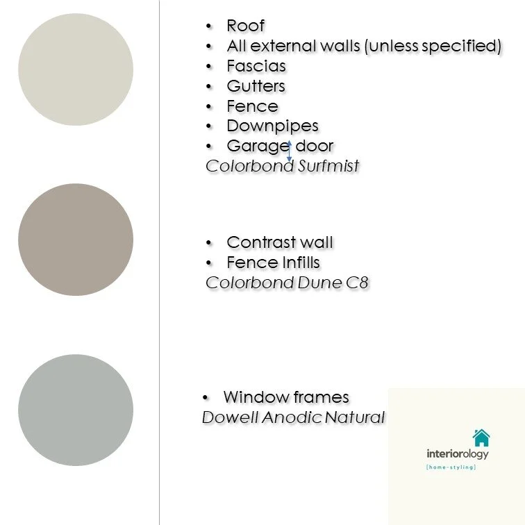
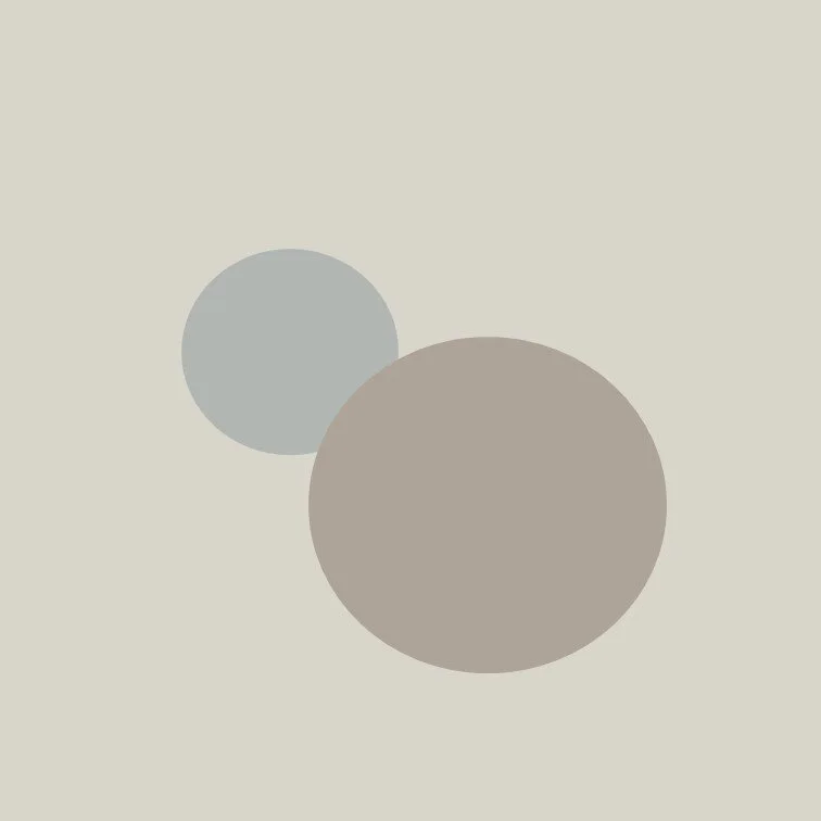
The colour scheme
I am not going to lie. Putting this colour scheme together was faster and easier than House 2. In part because I didn’t have to work around existing choices, but also because this is a simple colour theme with only two real colour hues.
That doesn’t mean that I wasn’t doing my job. A big part of my job is being able to translate what people want into a colour palette recommendation. Using real world examples isn’t cheating - it’s using the resources I have at my disposal and knowing how to translate them into real recommendations.
So without further ado, here we are.
First Glimpses
House 1 is now well under construction with exterior and interior work being done at a rapid pace. I dropped over to the site recently and was thrilled with the way things are coming along!


As always, I love hearing your thoughts and feedback. And of course, if you are a builder, developer or just someone looking to build a new home, don’t hesitate to get in touch! I can help you.