Choosing a Hamptons-inspired exterior colour palette - House 2.
The story so far…
So as I mentioned in a recent blog, I was recently asked by a local builder to work on some exterior palette options for two new homes he is building.
Each home is two storeys, with 4 bedrooms, two bathrooms and on blocks of around 350sqm.
House 2 is on a corner block and faces West, with the outdoor space facing North. Next door, House 1 also faces West.
By the time the builder came to me, he had already had to make some early decisions about House 2. Specifically, he had already approved a roof in Colorbond Monument, feature bricks from Midland Brick in the Hudson style, and window frames in Anodic Natural by Dowell.
However, as his wife (who is also a good friend) put it to me ‘we are pretty crap with colours’ so I was asked to complete the palette for House 2 and then develop a palette from scratch for House 1.
This project has easily been my largest to date and I have loved every minute of it - from regular trips to Bunnings to site visits and frequent chats with my friends at Dulux (who provide a great Live Chat service and free samples for designers).
This post focuses on House 2, with a separate post about House 1 coming soon.
House 2
As already mentioned, House 1 came to me with some existing colour choices already made. I am still of two minds about whether or not that has made my life easier or more difficult. Probably a bit of both.
Features already locked in included:
Roof in Colorbond Monument.
Window frames in Anodic Natural
Feature brick - Hudson by Midland Brick


The exterior of the house has been designed to carry two colours - a main and a contrast.
Given the existing colours, I decided pretty early on that I wanted to use light and natural colours as much as possible. Too many dark colours, and the house would not only look dark and depressing, but anyone living in a hot climate like Perth would know that dark colours = higher energy bills.
The next step was deciding whether or not to use two separate colours or one colour, with different strengths.
Initially I played around with different strengths of the same colours being applied to the main walls and contrast walls, but found that the contrast was too minimal - in some light, it might be hard to tell the difference at all.
Instead, I decided to focus on finding two perfect colours that went with the existing palette.
Finding a palette theme
What do I mean by a palette theme?
When I have developed colour schemes for houses in the past, I have always tried to identify some sort of underlying theme that would naturally introduce a consistent and complementary colour scheme. For example, with a property my husband and I built a few years ago, I found myself constantly commenting on the beautiful Eucylyptus trees around the site. One day, like a lightening bolt, the colour theme came to mind - Australian Bush! After that, selecting colours for both the inside and outside of the house was much easier - think muted greens and taupes that capture the beauty of the Australian outback, without taking away from what I hoped to be a modern house.
Deciding on a theme palette for this house was actually pretty easy. With a dark grey roof, and and lighter grey materials already selected, a take on Hamptons-style came to mind pretty quickly.
With that in mind, it was then clear that I had two colours to select - a white for the majority of walls, and a grey for the contrast walls. A classic colour combination, greys and whites look beautiful on the outside of a house, and depending on your selections and features, can produce either a modern or more traditional look.
Step 1 - Choosing an exterior white
As countless interior design blogs and professionals have already said, there is a seemingly endless array of whites in the world! Where do they all come from - why are there so many?? I don’t know - but wow, it can be confusing!
After much deliberation, consideration and discussion (with my husband and kids - who thought I was going mad!), I settled on three options. All three options use well-known whites, on the ‘whiter’ end of the scale, with two being cool whites and one being a very mild warmer white.
White 1: Lexicon Half
A perennial favourite, both inside and out, this white is everywhere at the moment. It is a white white and with a touch of grey, a ‘cool’ white. It comes in quarter, half and full strength. When painted it creates crisp white walls.

White 2: Casper White Half
Another cool and crisp white, this colour is a tad warmer than Lexicon and so will produce a little less glare when painted on a surface subject to significant sunshine (think those North-facing walls in the entertainment area).

White 3: White Exchange Half
Another favourite, this white is a warmer white than the other options and provides a slightly creamier take on white.

Recommendation?
As a significant part of the house faces North, and is situated on a corner block, I decided pretty early on that Lexicon would not be the correct choice for this house. That left me with two options - Casper White Half and White Exchange Half. Although I personally really liked White Exchange Half, I was concerned that the creamier tones would clash with the grey tones found in the roof and window frames. For that reason, and because it is a lovely colour in its own right, I recommended Casper White Half.
First glimpse…
So, the best thing about being an interior designer is seeing your work become real. Although there is still much work to be done on the site, I am thrilled to show you some early pictures of House 2 going up, with the Casper White Half already painted on the upper level. What do you think?


Step 2 - Finding a grey
This step took less time than finding the perfect white, because I always had a particular grey in mind - Dulux’s Tranquil Retreat. This grey is well known to my builder friend and often used for both new and renovated homes. It is a lovely cool grey and looks timeless and elegant on any surface.

The good news…
So I put this recommendation to my builder friend and he was totally on board. Great news!
But then…
Unfortunately, as we got talking we realised that we would have to paint the garage a grey to match Tranquil Retreat. Although a garage door can be painted any colour, my builder friend’s experience was that it was often easier and more cost effective to use a Colorbond Colour.
Back to the drawing board (sort of).
A discussion followed and in the end we agreed to replace the Tranquil Retreat with Colorbond’s Shale Grey. Shale Grey is a pale, neutral grey.

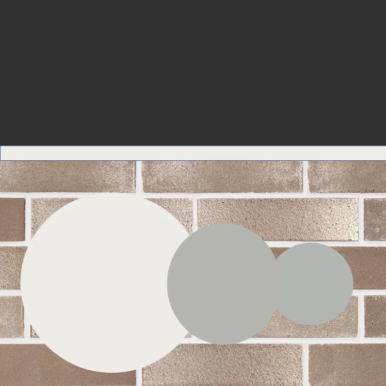
Final Palette Reveal
,So, here is the final palette…. Let me know your thoughts in the Comments section below.

Here to help you if you are about to build.
Building a new home can be daunting, regardless whether you are a private citizen building your dream home, or a professional builder working on your latest investment.
Hiring someone like myself makes a lot of sense. Not only are we familiar with what colour options there are, we know how to select colours based on your ‘vision’, your market, location, and even the direction that your home faces!
Get in touch today if you would like to discuss. It is obligation free and I am very happy to chat.
Ax