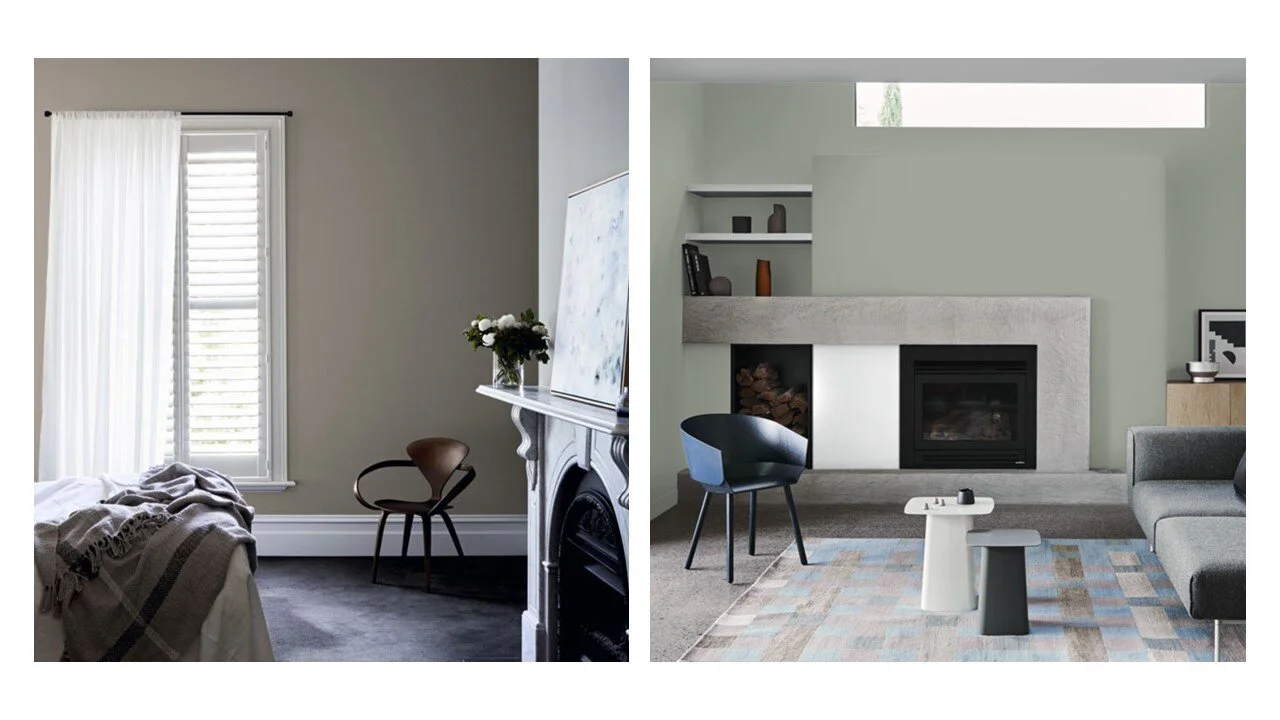
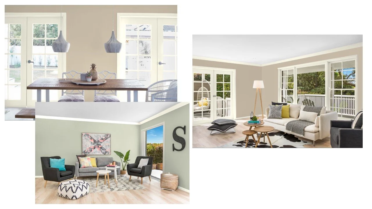
Greige and Sage Colour Palette
I have recently completed a small project for a lovely client that involved developing internal colour selections for her soon to be built new home.
We met for coffee a few weeks ago to discuss her needs in person and it was immediately clear that she knew exactly what she didn’t like - white! Throughout our time together, she regularly came back to this point - that she was relatively relaxed about the paint colours to be used, so long as they were NOT white!
We see so many homes painted in modern, cool, crisp whites these days so it was a lovely change of pace to work with someone who did not want that. Instead, my new client was looking for a home with classical and warm tones. On the main walls we decided on a greige (a combination of grey and beige) while the Games room was to be painted a sage colour.
These are colours I am naturally attracted to as well, especially sage, so it was great to meet someone who had similar tastes to me.
The one curve ball was that she wanted her trims to contrast with the wall colours which meant finding a lighter colour that provided a true contrast while respecting her wishes to stay away from white.
Working with her floor, tile and cabinetry samples, I got to work.
All her samples were warm toned - from brownish carpets to greige and cream tiles, to sage splash backs and warm timber cabintry.
With that in mind, I started with a visit to my local Bunnings to collect some samples in addition to those I already have. Oh, how I love the paint section at Bunnings. Is it just me or does it feel like a place where you can create a whole new world?
Over the space of a few days I whittled away a large range of colours in greige, sage and cream (not white!) to finally reach three options.
Option 1: Dulux
Option 1 was perhaps my personal favourite and made up of Dulux colours. Of the three options, this option’s greige had the highest level of grey to its tone and the coolest trim colour (in this case a very light silvery white).
If you want to replicate this scheme at home, colours are:
Main Walls - Ancient Ruin
Games Room Walls - Pozieres
Trims - Silver Tea Set
Applying the colours to the Dulux Visualiser I was able to create the following examples of how the paints might look when applied.
Option 2: British Paints
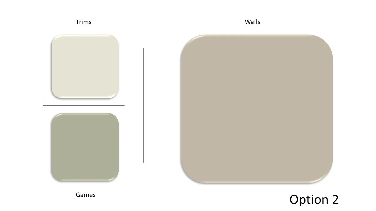
Option 2 comprised of British Paints colours and was a warmer option when compared to Option 1.
Option 2 included:
Main Walls - Stone Path
Games Room Walls - Cabbage Field
Trims - White Hub
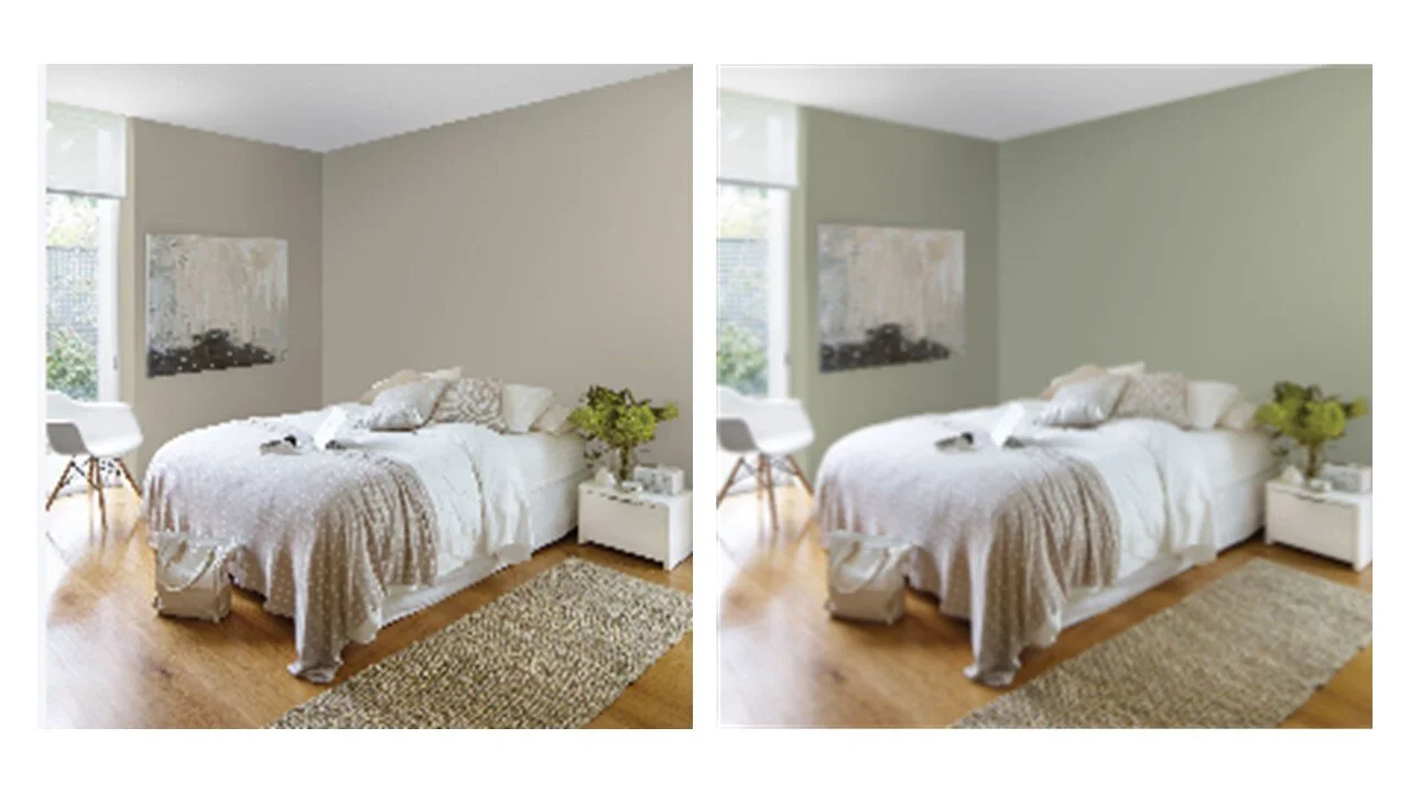
Applying a paint colour visualiser produced these examples.
Option 3: Taubmans
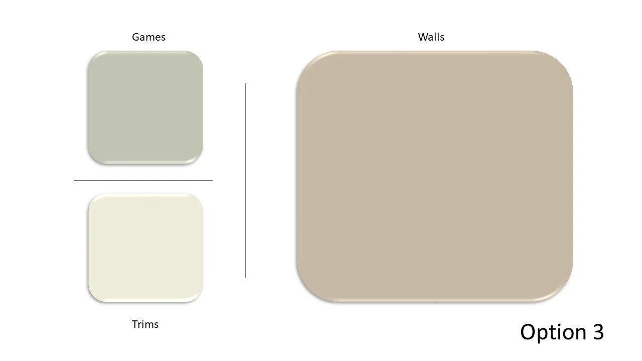
Option 3 contained the warmest tones of the three options and included the most ‘coffee coloured’ greige of the schemes.
Made up of:
Main Walls - Fossil Find
Games Room - Misty Lakes
Trims - China Doll
Applying the colours to a paint colour visualiser produced the following.
Final decision
Ultimately the client decided on Option 3 by Taubmans.
Reflecting back on our first meeting, I think she has picked the perfect palette for her. Trims in a cream colour and a warm coffee inspired greige wall colour, I am very excited for how her new home is going to look when completed.
What do you think? Which of the three options do you prefer? Let me know :-)
If you are about to undertake a new build or renovation and need help selecting colours (or anything else), then get in touch!

